
The avant-garde art of the 1920s has had tremendous influence on the development of graphic design. You can find these inspirations in today’s rock music videos as well. Below, I chose a few examples which I personally find the most interesting.
In the 70s in Germany a music genre called Neue Deutsche Welle (New German Wave) came into existence. The style quickly became popular and spread throughout whole country, only to end up as a gaudy trend. It has to be mentioned though, that its roots lie in very good German bands such as Kraftwerk, DAF and Einstürzende Neubauten.
Kraftwerk belongs to electronic music pioneers and, at the same time, it had great influence on the growth of other music genres. Visually-wise, the members of Kraftwerk always had a distinguishable, visible image, which changed accordingly with the longplays that were published. Surely, it can be said they had good taste – the graphics on their covers were consistent with visuals during their concerts, it also went well with the steady, electronic rhythm of their music.
Let’s take a look at the cover for “Man Machine”. This project even has its place in the MoMa collection in New York. The artists behind this design are Karl Flefisch and Günther Fröhling. The color palette is narrowed to black, white and red – the so-called poster colors, where black and white create the ultimate contrast and red functions as the dominant element. Red also has radically different meanings. On the one hand it is associated with love, warmth and energy, on the other – with war, violence and blood. The composition of the cover is dynamic, based on diagonal lines and perspective foreshortenings. Letters are sans-serif, simple, there is also strongly visible use of multiplication, repeatable rhythm. All of the above characteristics can be assigned to the main stylistic traits of an avant-garde movement – Russian constructivism of the 1920s. The ‘Man Machine’ cover is thus a pastiche, an intentional reference to the 20s Russian avant-garde.

Design by: Karl Klefisch, Günther Fröhling, El Lissitzky, “Beat the Whites with the Red Wedge”, 1920
And here’s the concert version of Man Machine: www.youtube.com/watch?v=Mkd7LbQnfIQ

The visuals for this concert are taken directly from the cover design. Slogans put into motion aptly underline the electronic rhythm of the music. At the beginning of October in Gugenheim Museum in Bilbao there will be held a series of Kraftwerk concerts accompanied by 3D projections: www.guggenheim-bilbao-kraftwerk
An even more futuristic cover is Kraftwerk’s ‘Electric Café’ from 1986. The band’s members look like robots, which goes well with their dehumanized music. Today, this kind of 3D effect isn’t very impressive but in the 80s it was a novelty.

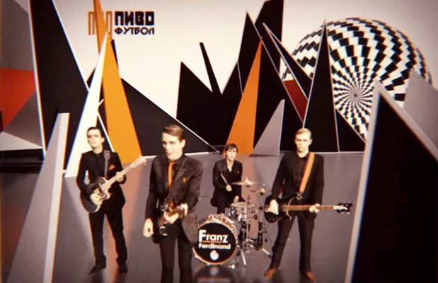
Another interesting take at avant-garde of the 20s is the music video for ‘Take Me Out’ by Franz Ferdinand. In this case, the project is more complex, as it is a few-minutes long clip where lots of references and inspirations can be found. Franz Ferdinand is a band formed in Glasgow in 2002 and its name refers to the Habsburg archduke’s name (Franz Ferdinand). Video for ‘Take Me Out’ was created in 2004 in cooperation with director Jonas Odell and graphic designer Matthew Cooper. Cooper designed also the cover for the album, which is a pastiche of the famous poster by Rodchenko:

The music video is full of influences of different avant-garde movements of the first half of the 20th century. There is futurism, collage, Dadaistic photomontage, Russian constructivism and neoplasticism. The base idea for the video is the combination of 2D animated elements with live recording of the band and 3D scenery – so a mix of flat animation with movie material, thanks to which collage effect was achieved. Despite this variety, each frame is polished and could be a stand-alone graphic. See for yourselves: www.youtube.com/watch?v=GhCXAiNz9Jo
Let’s take a closer look at the inspirations for this video: at the first glance we can recognize Dadaist collage aesthetics and typical for avant-garde art compositional freedom. The colors are narrowed down to black, red and white, so Russian constructivism here. Additionally, there is the yellowish paper effect to add a more vintage look. In animations we can see numerous multiplications, newspaper-like screen rulings and letters cut out from newspapers flying around. Loosely composed typography sometimes comes from the song lyrics, underlines its rhythm, and sometimes it’s just a single, random word. Appropriating chance and underlining absurd is obviously one of the main characteristics of dada creations.
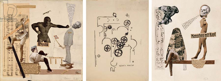
Erwin Blumenfeld, Humans With Brains, photomontage, 1921
In animations there are many machine drawings, cogwheels, charts and diagrams. These are surely inspired by futurism. Italian futurists loved technical imagery, but there were some machine-lovers among Dadaists too – Francis Picabia’s early art and his fantastic mechanical drawings, for instance. Next, we have a box fight – also a famous dada motif. In 1916 Dadaist Artur Cravan challenged to a fight the heavyweight champion Jack Johnson. It was of course a Dadaistic provocation, one of those most absurd ones, as Cravan stood no chance. Nevertheless, posters informing about the fight and inviting audience were put up. In the analyzed video there is a box fight between Franz and Anti-Franz, which is a beautiful metaphor of the fight between art and anti-art, meaning Dadaism. Besides, divagations on the subject whether Dadaism is art or not are being continued even today, partly because of dada artists themselves, who in a provocative way talked about the death of art. They didn’t want their art to be put in fossilized, in their opinion, museum galleries. So the duel from the video clip is not so much between fighters as it is between values.

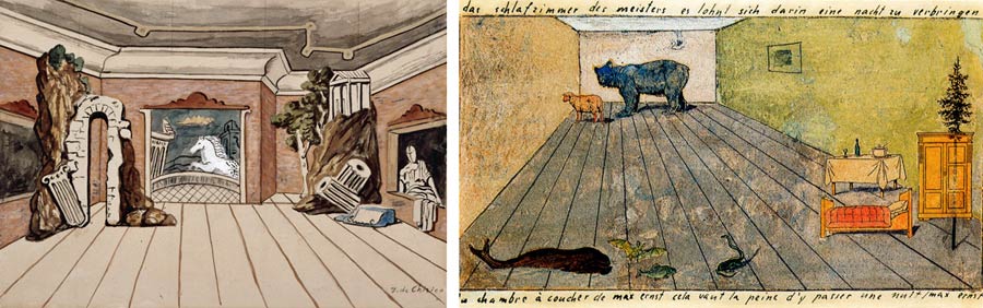
The scenery in which the animated characters move around makes use of many diagonals and perspective foreshortenings, like in the paintings of Giorgio de Chirico, the forerunner of surrealism. Then, spaces like that appeared in pieces of Max Ernst (at first associated with Dada movement, then surrealism). This type of composition was also used in the fantastic animations of Terry Gilliam (the author of drawings and animations for ‘Monty Python’s Flying Circus’.
Racks and mannequins can be a reference to collages by Grosz, Huelsenbeck, Hannah Höch and other Dadaists specialized in collage art. In the video we can also see flashes of organic assemblages by Hans Arp, or even Ready-made objects of Duchamp – a bicycle wheel! Besides spirals, shields for shooting and other centric compositions are also present every now and then in the clip. Set into motion, they seem to emit sound waves – and that was exactly the point, surely inspired by Marcel Duchamp’s rotoreliefs. Robot-people made of tens of moving cogs are not only a homage to Picabia, but the 20s avant-garde in general and also… to Kraftwerk.

In Franz Ferdinand’s project we can also find military and industrial inspirations by Laibach’s ‘The Final Count Down’ music video (from ‘NATO’ album from 1994). Laibach’s song is a cover for the famous hit by the band Europe, yet the version of the Slovenian band was recreated as a reaction to the Bosnian War. In this context the meaning of this popular song changes completely. www.youtube.com/watch?v=-E72v6G9JHY
The stylistic in Laibach’s clip can be described as military and industrial with elements of totalitarian war. It refers to early futuristic films (Metropolis) as well as to futuristic machines and robotic people, Kraftwerk-style. In one of the scenes there is a checkered Greek cross – the band’s logo, the form of which is inspired by Malevitch’s painting. It might be worth mentioning here that for Duchamp chess was the domain of art and chess players – artists. In Laibach’s music video there are also present Duchamp’s rotoreliefs, among which we can see various military objects and green NSK (Neue Slovenische Kunst) passports. Laibach belongs to a virtual country called NSK, where anyone can become a member after receiving such passport (NSK has now more citizens than Vatican). In the final scene of this futuristic animation we visit the Embassy of NSK on Mars. 🙂 In regards to this, it is worth mentioning that Russian constructivists of the 1920s also had utopian and futuristic visions of sending their designs into space, which is very close to the ideas in Laibach’s video.

Given the amount of nuances and references, I think the music videos mentioned above are directed at a more sophisticated audience that knows its ways around the subjects of history of art and history of entertainment music. But is it only for them? It turns out that catchy songs and visually attractive video images gained a commercial success as well and were well received by ‘ordinary’ listeners. ‘Take me out’ became a hit and brought upon Franz Ferdinand international fame – it is a proof that sometimes it is possible to match good design with commerce. It is also commendable that the creators of the video managed to successfully stitch into stylistic oneness so many styles, techniques and various inspirations!
Another great video clip by Franz Ferdinand in terms of visuals is ‘This fire’ – inspired by avant-garde (especially constructivism and Bauhaus) and totalitarian art. There are also visible influences of pop art (Roy Lichtenstein) and the band members in black shirts with red additions are definitely after the Kraftwerk image! Multiplicated rows of the musicians look like the Third Reich army from Leni Riefenstahl’s films, and spiral compositions are borrowed from the Steinberg Brothers’ posters. We also have a visible reference to dark, German expressionist films from the beginnings of the 20th century. Despite the bold mix of different styles and references to art movements, this music video is also very uniform, see for yourselves: www.youtube.com/watch?v=VHUxS8qkO8M

And for dessert, a ride in futuristic train – ‘Trans Europa Express’ – Kraftwerk: www.youtube.com/watch?v=zOfh7YdugzQ
text by Anna Klos
translation by Karolina Klos