
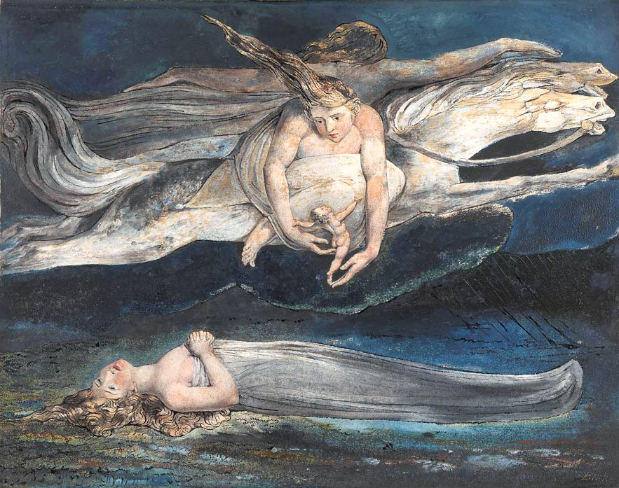
When painting or composing any project one should consider that different compositional layouts evoke different effects on the viewer and might evoke different connotations. The dominance of horizontal lines in a painting or a graphic design project symbolizes peace, stagnation, melancholy or even sadness. This results from subconscious association of horizontal position with sleeping, retirement or death. Here is an example of a melancholic painting by William Blake:
And here is another example, a cover for Stephen King’s book by Daniel Chudy (it is a part of his diploma project realized under my direction). In this project, horizontal lines reflect the gloomy mood of the story, while the gradual change of straight lines into more vibrating ones refers to the changes in main character’s psyche. So it is a transition from absolute peace to growing tension.

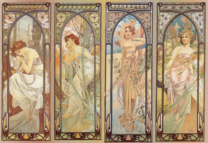
The dominance of vertical lines symbolizes strength, vitality, growth, life energy, potency, so in general it gives positive connotations. If we add juicy colours to such composition, surely it will evoke positive emotions, it will remind us of spring vigor. Vertical forms can be found i.e. in the art of Gothic period, then there was a visible tendency for this type of compositions in secession (Art Nouveau). In a more philosophical sense, the dominance of vertical lines symbolizes hope and cheerfulness, while the dominance of horizontal lines reflects stagnation, resignation, depression, lack of willingness to act.
Sharp, soaring forms might also be associated with dynamism, aggression. They strongly attract attention, like in this project by Daniel Chudy for ‘Children of the Corn’. Multiplication and similarity of sharp, contrasting forms might additionally be associated with crime and the title corn field with a ghastly labyrinth without exit.

Combination of horizontal and vertical lines designates order, harmony, peace and balance. Piet Mondrian, among others, was on the lookout for the perfect harmony. Of course in his compositions colour is equally important, but let’s leave that for another occasion. Here’s one of Mondrian’s more famous pieces:

The most dynamic compositions are the ones based on diagonal lines and foreshortenings. The dominance of diagonals is associated with dynamics, expression, motion, fight. Many examples of dynamic compositions can be found in the art of older periods. This is one of the most famous paintings of early renaissance “The Battle of San Romano” by Paolo Uccello. Here, in a literal way, the artist wanted to show the dynamics of a fierce battle through a dynamic composition.

Let’s move on to contemporary, avant-garde art. Dynamics and motion fascinated Futurists. It was directly connected to sudden technological developments, but also had on purpose visual enforcing of radical, futuristic manifestos. Below you can see a futuristic collage by Carlo Carrà. In this work, dynamic composition based on diagonals was enforced by a spiral.

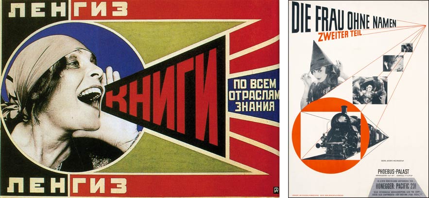
Dynamic compositions were the characteristic trait of pre-war avant-garde graphic design. I’m thinking here especially about Russian constructivism. Dynamic compositions were also the trademark of German expressionists. In expressionistic film “The Cabinet of Doctor Caligari”, by Robert Wiene from 1920, the overwhelming amount of sharp, diagonal directions in the scenery is meant to confuse the viewer and reflect the madness of the main hero.

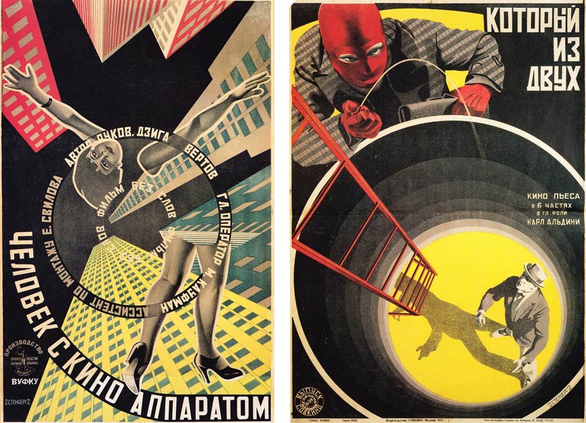
Asymmetrical compositions, foreshortenings and numerous diagonals in the designs of Russian constructivists or Jan Tschichold were a breath of modernity and an attempt to abandon the previous “boredom in design”, that is – traditional typography based on central, horizontal lines.
Enforcing dynamic compositions with spirals and perspective play gives additional strength to a project, introduces additional movement and might cause a vertigo. Masters of this type of bold compositions were the Stenberg Brothers:
Spirals were also willingly used by the animation master Saul Bass in his posters and movie intros. It is said that it was he who suggested to Alfred Hitchcock the most famous scene in history of thrillers – the scene of murder in the shower from Psycho. This scene is also based on a spiral composition:

on the right: scene of murder in the shower from A. Hitchcock ‘Psycho’
translation by Karolina Kłos
Pingback: Reid Miles for Blue Note – Blue jazz series – Retroavangarda